
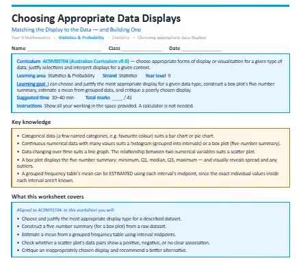
This worksheet teaches students to choose and justify the most appropriate data display for a given data type, and construct a box plot's five-number summary. The worksheet is split into warm-up questions, standard questions and then extension questions to test you.
The concepts it covers:
- Categorical data (a few named categories, e.g. favourite colour) suits a bar chart or pie chart.
- Continuous numerical data with many values suits a histogram (grouped into intervals) or a box plot (five-number summary).
- Data changing over time suits a line graph. The relationship between two numerical variables suits a scatter plot.
- A box plot displays the five-number summary: minimum, Q1, median, Q3, maximum — and visually reveals spread and any outliers.
- A grouped frequency table's mean can be estimated using each interval's midpoint, since the exact individual values inside each interval aren't known.
What your child will practise:
- Choosing and justify the most appropriate display type for a described dataset.
- Constructing a five-number summary (for a box plot) from a raw dataset.
- Estimating a mean from a grouped frequency table using interval midpoints.
- Checking whether a scatter plot's data pairs show a positive, negative, or no clear association.
- Critiqueing an inappropriately chosen display and recommend a better alternative.
Every section opens with a worked example, and the download includes a full answer key with step-by-step solutions and teaching notes on the mistakes students most commonly make.
.webp)


.webp)
%20(1).webp)

