
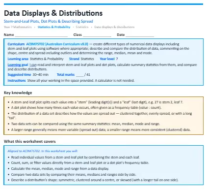
This worksheet builds data literacy, teaching students to read and interpret stem-and-leaf plots and dot plots, calculate summary statistics from them, and compare distributions. The worksheet is split into warm-up questions, standard questions and then extension questions to test you.
The concepts it covers:
- A stem-and-leaf plot splits each value into a "stem" (leading digit(s)) and a "leaf" (last digit), e.g. 27 is stem 2, leaf 7.
- A dot plot shows how many times each value occurs, often given as a frequency table (value : count).
- The distribution of a data set describes how the values are spread out — clustered together, evenly spread, or with a long "tail".
- Two data sets can be compared using the same summary statistics: mean, median, mode and range.
- A larger range generally means more variable (spread out) data; a smaller range means more consistent (clustered) data.
What your child will practise:
- Reading individual values from a stem-and-leaf plot by combining the stem and each leaf.
- Count,ing sum, or filter values directly from a stem-and-leaf plot or a dot plot's frequency table.
- Calculating the mean, median, mode and range from a data display.
- Comparing two data sets by comparing their means, medians and ranges side by side.
- Describing a distribution's shape: symmetric, clustered around a centre, or skewed (with a longer tail on one side).
Every section opens with a worked example, and the download includes a full answer key with step-by-step solutions and teaching notes on the mistakes students most commonly make.
.webp)


.webp)
%20(1).webp)

